Design begins with light and ends with color.
Every shade you select shapes mood, rhythm, and presence.
A thoughtful palette transforms a house into a home—an environment that reflects identity and emotion with quiet precision.
Selecting colors is not decoration. It is composition. Each hue becomes a note in the symphony of your space. Here’s how to build a palette that feels deeply personal and timeless.
Drawing from Nature
The outdoors offers the purest inspiration.
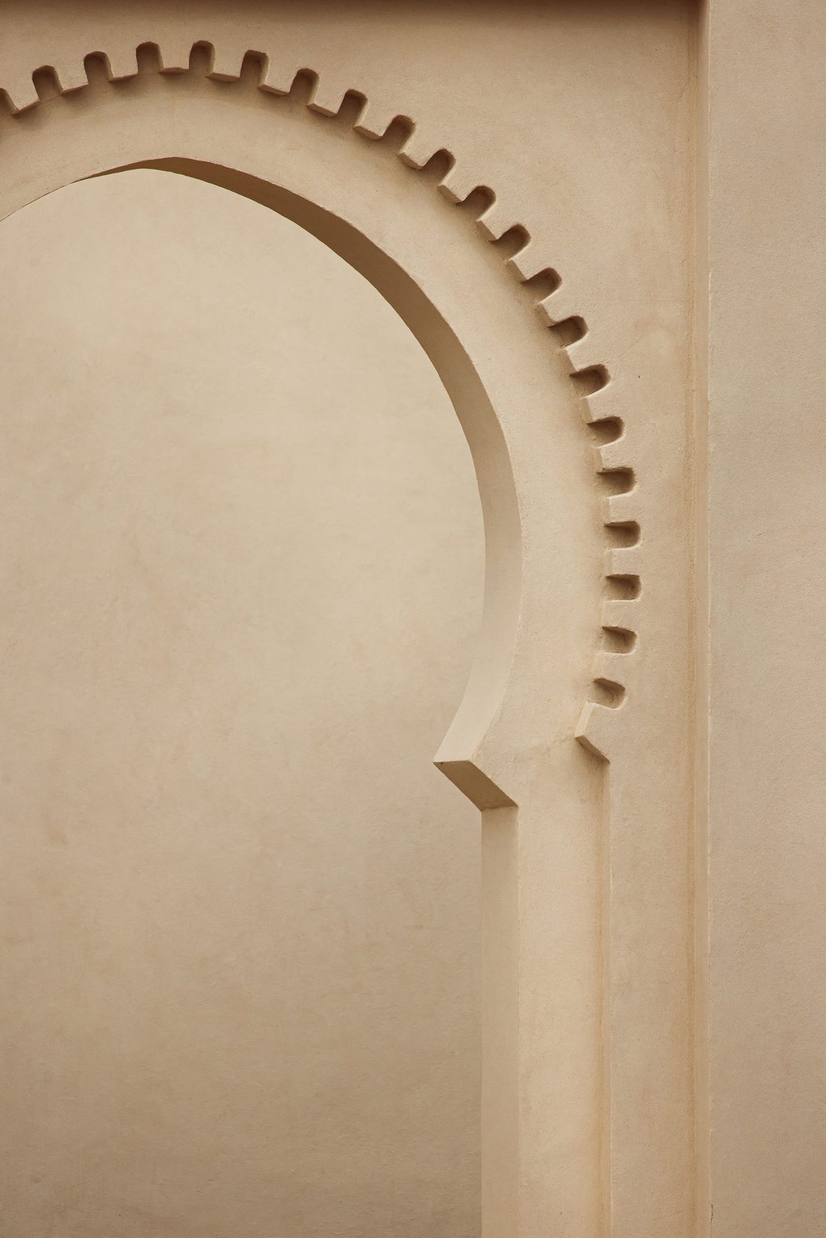
Observe what surrounds your home—the soft green of nearby trees, the warm beige of earth, the cool blue of sky. These tones create harmony when carried indoors.
By echoing nature’s palette, you form continuity between exterior and interior. A home that breathes with its landscape feels grounded and alive.
Natural palettes also adapt with time. As daylight shifts, colors respond with nuance, giving depth and calm to each room.
Setting the Mood
Color speaks in emotion. Each hue evokes a response.
Before choosing, ask how you want each room to feel.
-
Cool tones—blues, greens, and greys—soothe and quiet the mind. They suit bedrooms, reading corners, or areas of reflection.
-
Warm tones—terracotta, ochre, muted red—energize and welcome. They work beautifully in living areas, dining rooms, and social spaces.
-
Soft neutrals—ivory, sand, and taupe—offer balance. They hold space for furniture, light, and texture to shine.
When mood and function align, color becomes more than visual—it becomes atmospheric.
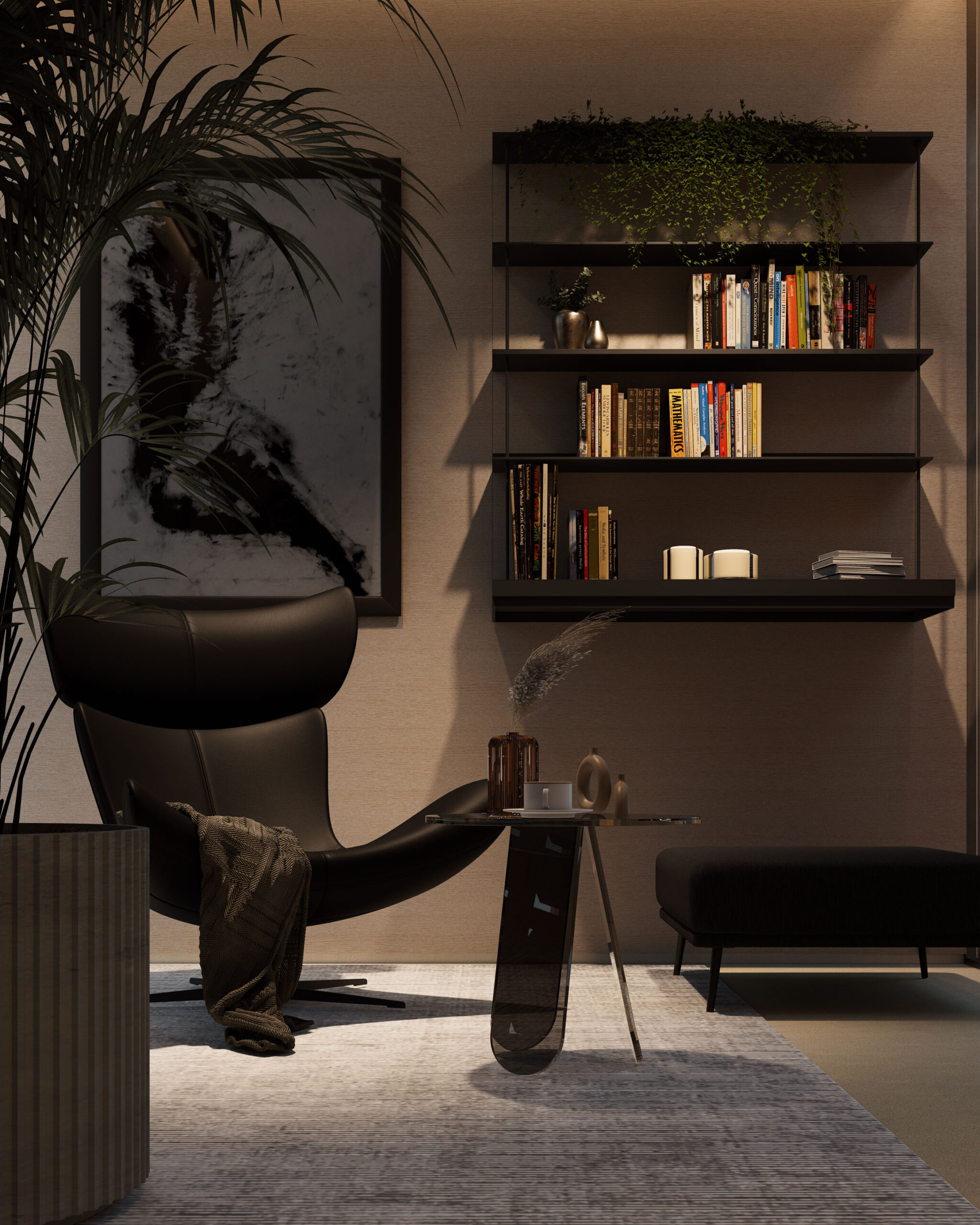
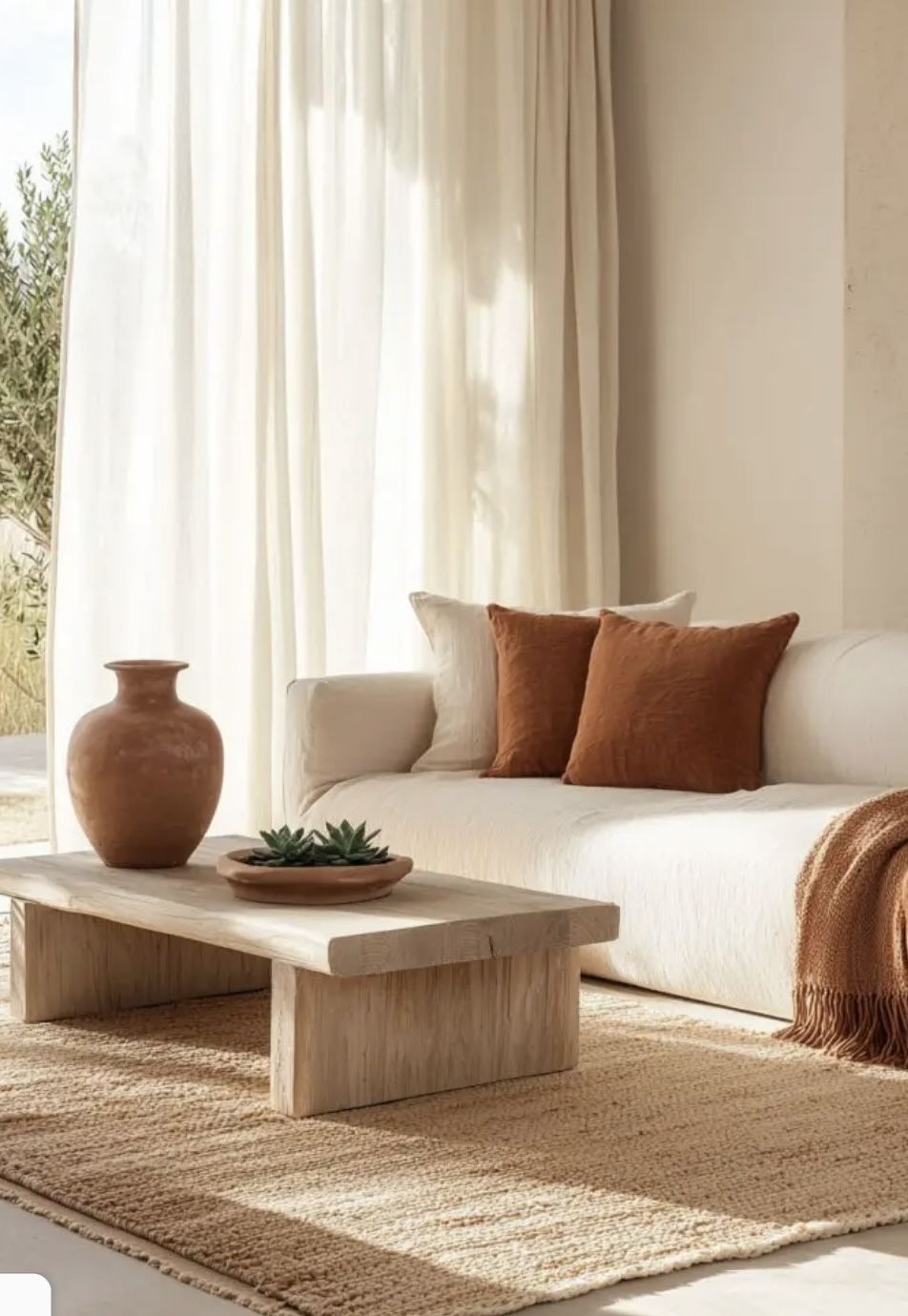
Neutrals as Foundation
A timeless palette begins with restraint.
Neutrals form the backbone of architectural design, allowing flexibility over time.
White, beige, and soft grey frame light and let texture take the lead—plaster walls, timber floors, linen curtains.
They act as a quiet canvas, ready for evolution. Accent tones—deep green, rust, charcoal, or gold—can be layered in as taste matures.
This approach ensures your home adapts effortlessly while preserving coherence.
Mastering Combinations
Harmony lies in proportion.
The color wheel offers guidance:
-
Complementary pairs—such as blue and orange—create contrast and vibrancy.
-
Analogous tones—like green, teal, and blue—produce unity and calm.
The key is rhythm. Bold accents should highlight, not dominate.
Let one primary hue lead, one support, and one accentuate. The result feels deliberate, not decorative.
Test combinations under different light. Morning sun reveals undertones. Evening shadows deepen hues. Live with samples before deciding; the right choice reveals itself with time.
Understanding Light
Light transforms color.
A shade that feels warm in daylight may turn cool under artificial glow.
In north-facing rooms, consider warmer tones to balance cooler light.
In sunlit spaces, muted shades often feel more refined.
Gloss levels matter too. Matte finishes absorb and soften. Satin or gloss reflects, brightening smaller rooms.
By aligning color with light, architecture gains dimension and serenity.
Texture and Tone
Beyond pigment, texture shapes perception.
A matte clay wall absorbs shadow; a polished plaster surface glows.
Wood, stone, and fabric carry their own hues—integrate them into the palette rather than treat them separately.
Design thrives when material and color speak one language. Together, they create rhythm and depth.
Evolving with You
A color palette should live as you do.
Start with a consistent base—then let accents evolve through art, textiles, and furniture.
Seasons may bring shifts: lighter tones in summer, richer layers in winter.
This flexibility ensures your home remains a true reflection of who you are in each chapter.
Crafting Your Story in Color
Every home tells a story.
Soft whites whisper simplicity.
Earth tones ground.
Deep blues evoke introspection.
Muted greens calm the breath.
Your palette becomes your voice. When chosen with care, it aligns space with soul—an environment that feels both personal and timeless.
At Roy Chaaya Architects, color is not an afterthought. It is a material—studied with the same precision as light, proportion, and texture. We build palettes that support architecture, elevate mood, and reveal identity.
A Final Note
Choosing colors is a journey of awareness.
Observe, test, and trust your instinct.
The right palette will feel familiar, as if it’s always belonged.
Let your walls reflect your essence.
Let light carry emotion.
And let architecture become a canvas for the life you imagine.